Thursday 25 April 2013

The Fruits Of My Labours Rewarded...(well, consolidated)

To be honest I didn't initially particularly like either of my A Level projects all that much, as although I enjoyed making the art, the projects never seemed to come together as I'd hoped.
However, I was filled with pride and slight smugness when I attended the A Level exhibition at my school and saw my work displayed in a most flattering way.
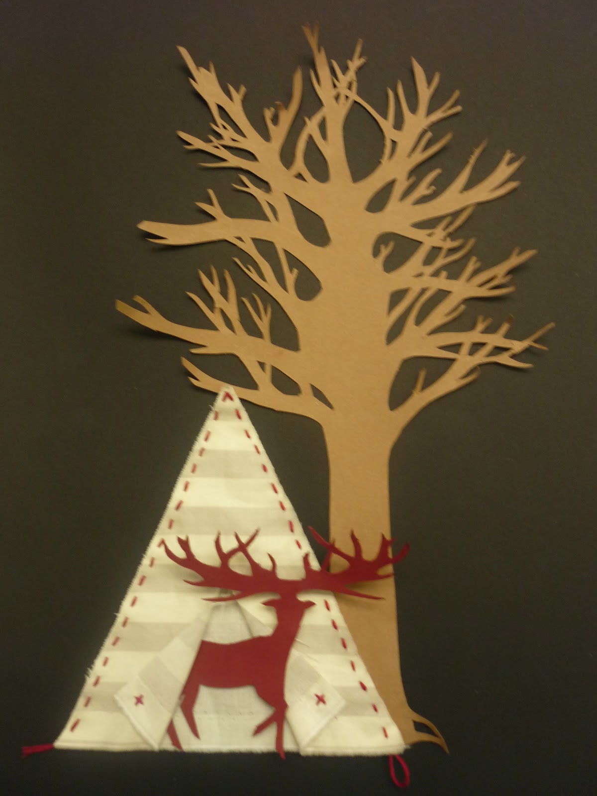
I was very happy, so I thought I'd let you have a look at what my corner looked like:


And also, I thought I'd include an image of some of my work in the sun in my room back in Sandwich, just because it was pretty. Also, meet Helga, my German mannequin. 
Gosh I miss the Kentish summer!


Scalpelled Books

With these experimental pieced I went to town with the whole concept of three dimensional book illustration, using the books themselves as tautological illustrations.
I drew from the influence of many artists for these.
The first is just a rough circular practise with ink solhouettes added to frame the spiral pages, which focus around the word 'doubt':


This second one was the final piece for my A Level Art coursework project. It illustrates a scene from my beloved Dickens' 'David Copperfield'. It went a bit wrong, but I still like it, as it's based on one of the original printed illustration plates. I just adapted it for three-dimensional translation, and added colour to contribute to the dingy Dickensian scene, but only a wash so that type would still be visible:


Finally we come to my favourite. I actually did this relatively recently for my friend, Heidi's, birthday.
The book was called the Black Swan (NOT the film), and I played it cool and stuck to what I know; a scalpelled forest scene...with swans in. Heidi's little sister then pointed out that while it was pretty, Heidi wouldn't be able to read the story. Bummer.


Mixed Media Piece

So my final piece for my A Level Art exam project was this: an A3 fantastical scene created from various scalpelled cards, fabric and painty/penny bits.
It went a bit wrong, and looks too simplified for my liking, but I only had 15 hours to do it, so hey ho.

I also had a wee bit of fun playing around with the components as the lower photo demonstrates. I'm thinking it might make a nice Christmas card?


Book Cover Experiment

You know how in a previous blog I told you about photo emulsion?
Well, I have a fondness for flicking through my family's old photo albums, and I came across some monochrome gems that I couldn't wait to photo emulsion.
This image is one of my grandad, Frank, as a young man (wasn't he dapper?!) and I set it against two old bookcovers that had fallen off some of my more loved specimens. I like the contrasts between the colours and textures of the covers, and I sewed the photo on with matching thread.
To make this even more pretentious, I added a caption in Latin using my parents' old typewriter (which is my baby). I think it means 'Youth is Eternal', but I can't be sure...google translate y'see.


Sketchbooks

These are just a couple of pages from my sketchbooks which I quite liked. I don't know why (most of them were rubbish) but I thought maybe you'd be interested. 
Topics are random. A bucket of soz to you.


One Day Illustration

I don't know if you've ever read the book 'One Day' by David Nicholls, but it's one of my faves and ages ago I illustrated it in a simple three-dimensional silhouetted image in which I attempted to capture the book's transition from Edinburgh to London, while focussing around a beautiful love story 
(oh I've gone all gooey, yuck).


Textiled Truths

I decided to pay homage to a Kentish heroine of mine: Tracey Emin, who I recently had the pleasure of receiving a lecture from at the Courtauld, and later meeting (briefly).
In her applique projects she created fabric collages of such patterned intensity and emotional force, that I couldn't help but want to do the same...so here it is. My shared secret:
I hold BIG (unnecessary) grudges. 
And in true Emin style, I created a photographic self-portrait with my work. 


Book Monoprints

I worked on a triptych of illustrations set against book pages which hopefully demonstrate my progressive expreimentation with monoprinting (another media of which I am very fond, despite its messiness and hit-and-miss nature).
First we start with a simple monoprint: its subject is loosely little red riding hood (note the tree motif...overused in my work? probably ha). Secondly we see a naval illustration monoprint partly adapted with the addition of watercolour paint to contrast the sea from the page.
The final print is a full combination of both monoprint and watercolour. I actually created it for the birth of my baby cousin, Jake, (see attached to the right his plain painted print - ignore my garish bed covers in the background...apologies) but in the context of the triptych I wanted it to be fancifully linked to 80 Days Around The World. 


Book Sculpture

This is potentially my favourite thing that I have created.
It is a freestanding 3-dimensional/2-dimensional book sculpture based on the work of Su Blackwell.
It was while creating this that I discovered my love of scalpelling as a media, 
and book pages as a material, reinforced with copper wire and wood, and set against a black card background to create a reverse-silhouette effect of sorts. 


Photo emulsions

Something a tad different...

These are experiments I did with photo emulsion: a media that I adore because of its spontenaity and individual aesthetic 
(you simply print off a picture, cover a piece of card or paper with white emulsion paint, place the picture face down on the wet paint, stroke firmly for a few minutes, and then peel the top layer away leaving a partial, enigmatic image)
Now I have done many a photo emulsion in my time, but these are the largest ones I have attempted (A4). They are the same photo emulsioned image of trees, but I edited them in different ways. The first one is washed with pepermint and english breakfast teas, to capture the autumnal contrast of the leaves, while the trunks are outlined in fineliner. The second is just sketched over - I decided to use it as a ghostly setting for a 1950s Madmen-esque scene.
Give it a go guys!


Monday 15 April 2013

Teacups

Following the templates/instructions provided online by Ann Wood, I tried to make my own teacups out of fabric, book pages, button and embroidered ribbon (not practical but relatively pretty). The last one I made for a friend who is an English Literature student - it seemed appropriate as we share a great love of books and tea, so why not combine the two:


Deer Linoprints

During my A Level Art I drew much inspiration from Olivier Dupont's book 'The New Artisans' & in particular the prints of Australian-based artist Puddin' Head. This is my pastiche to his work:


I created three linoprints - the first on normal white paper, the second on burgundy card, and the third on linen, embroidered with burgundy thread to bring the three together in a repetitive triptych. 

Teacup Photography

These were just some teacup images from my A Level project, taken while messing around with photography. I tried to adopt an honest, focussed photographic approach to create a realistic portrayal of unrealistically arranged crockery. This realism to me communicates the true diversity in colours and textures of things, probing the question: should we really edit photographs to the extent that we do?
P.S. each of the three teacups used has a special story behind it, but my favourite is the miniature matching set, which belonged to my great grandma and now lives with me.